
Hey everyone, as you can see Im pretty new to the yotatech forums. Anyways, I am thinking about joining this new owner's club and while wasting time in accounting class, I came up with these logos. If the club is named 4ROC, I thought you might like to check them out. I could mofify them, change colors, fonts, etc. I just made them real quick on MSPaint. I could possibly make more profesional looking ones using my other computer programs. Anyways, look forward to becoming a member and talking to everyone. I figure anyone can post their homemade decals and ideas on this thread and maybe have a poll later.
Later,
Dave

Later,
Dave
Registered User
heres from screwin around in photoshop  i just thought it would be cool to some how use the logo from the car... to make it easier for stickers if anyone likes it we could make it a plain color. i know its only what the second gen logo looks like, but like i said i was screwin around and happend to know just what it looked like
  (there fixed, thanx prolax)
i just thought it would be cool to some how use the logo from the car... to make it easier for stickers if anyone likes it we could make it a plain color. i know its only what the second gen logo looks like, but like i said i was screwin around and happend to know just what it looked like (there fixed, thanx prolax)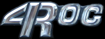
Registered User
I like that logo r2xj! Here is that logo in a solid color (i know my photoshop skills suck). I like the logo because it uses the actual 4Runner logo and because it is simple. It can be used over various backgrounds like the way TTORA has different stickers for each chapter.

Registered User
heh heh thanx snoozer! that was along the lines of my idea when i began, but then i decided to see if i could make it look like the real logo 

Senior Member
Here is a quick and dirty one I came up with. Be very easy/cheap to have printed (i.e. t-shirts, stickers, etc) since it's only 2 colors.

Registered User
heres another play on the 4runner logo, various colors, the black background just for contrast... (i think its time to find a host for my pics eh?)

Contributing Member
Quote:
Originally posted by Gene

Hands down winner in my opinion...this one rocks!!Originally posted by Gene
Contributing Member
Yup. I'd say that's the one Gene as long as there isn't any copyright infringements using that style. I would also recommend removing the "www." as that is always a given and would clean it up and simplify the design even more.
I just slapped on the TRD off-road decals on mine this week. I guess we'd have to figure out where to put these huh? If this design is the keeper, we'd have to make them in the various color combos as the TRD ones. Lookin' sweet!
I just slapped on the TRD off-road decals on mine this week. I guess we'd have to figure out where to put these huh?
If this design is the keeper, we'd have to make them in the various color combos as the TRD ones. Lookin' sweet!
Registered User
yea, i'm liking dreads design..hope TRD doen't sue...you should run it by them!!!
Hey Gene, Im really liking your design. Just wondering though. Is there anyway you can stretch the "4" so its got the same vertical dimensions as the "R". Id like to see how that looks it you dont mind. Great design though. And what is that font called?
Later
Dave
Later
Dave
Contributing Member
i think dread's is really cool, but i kinda prefer the 4runner "4R" over the TRD one. maybe the two can be combined..
Registered User
I also really like Dreads design. TTORA has one like that, so there are 0 copyright problems. I think that is also the winner hands down. I think we should make them in diff sizes too.
Good idea. Mulitiple sizes would be convenient. Maybe multiple color combinations.

Contributing Member

Also silver/red and silver/charcoal. And what about removing the "www?" Maybe I'll do a little playin' with Photoshop here in a litte too.
The red/black one is nice too. Lookin' sweet. Start printing them up!

If only the club turns out to be half as sweet as those stickers/decals, we will have one sweet group!

Contributing Member
Quote:
Originally posted by Gene
First one was red/black.
Yeah, I know. I edited my post about 5 seconds after I posted it! I didn't think anyone was browsing this thread when I did that. Guess not!Originally posted by Gene
First one was red/black.
Contributing Member
Quote:
Originally posted by Gene
I think I gotta say that I like the "www' better, it fills the space.
Still not bad, but I do see what you mean now that you have an example. It's not that the original was cluttered in the least, but I'm usually a fan of white space and removing unnecessary elements.Originally posted by Gene
I think I gotta say that I like the "www' better, it fills the space.
How about stretching the "4ROC.com?" I guess that may make the text inconsistent though. Hmmm. Guess I'll just have to keep looking at them.
Nice job once again.


